Styling Masonry Widget
You are reading the Classic Widget Documentation
Classic widgets are a previous widget version for onsite widgets created before September 23rd.
From September 23rd 2025, all new widgets created will be NextGen.
Please check your widget version on the Widget List page to see if it is Classic or NextGen widget.
You can read the NextGen widget documentation here.
Overview
This article will instruct you on how to custom style a Masonry Widget using Custom CSS. If you're looking to customise a widget using our Javascript API - you can find the documentation here.
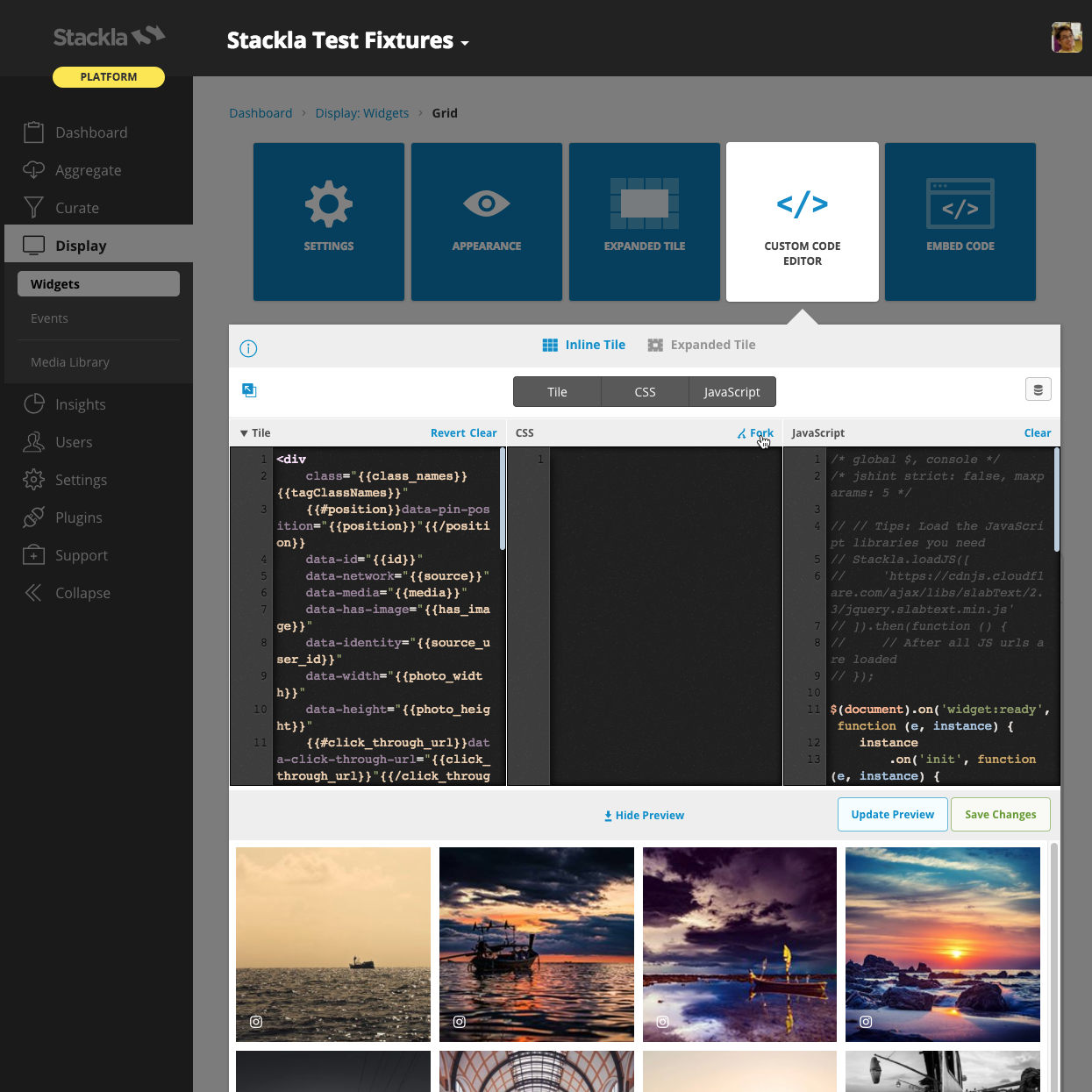
Use the Code Editor
You can use the Code Editor to modify both your Custom Tile, Custom CSS and JavaScript. The CSS editor supports LESS CSS pre-processor. That means you can use both traditional CSS syntax or the better LESS syntax.
Fork from Nosto's UGC
You can now also click the fork link at the top-right corner of each editor pane. This brings the boilerplate code from the Nosto's UGC codebase so that you don't need to write from scratch or copy & paste from our Developer Portal.
Custom Tile
Currently the Custom Tile editor is only available in the Grid, Masonry and the Blank Canvas widgets. Unlike other widgets, you are free to change the tile HTML structure according to your need. However, you will need to learn the template syntax Mustache.js. You can check which tile properties are available.

Layout Structure
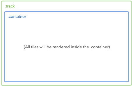
The below Layout demonstrates the wrappers of our Widget tiles.
|
Diagram

|
Code
| | --------------------------------------------------------------------- | ------------------------------------------------------------------------------------------------------------------------------------------------------------------------------------------------------------------------------------------------------------------------------------------------------------------------------------------------------------- |
Possible Scenarios
Changing the background style by setting
bodyselector.Changing the widget margin style by setting
.trackselector.Changing the tile container style by setting
.containerselector.
Tile Structure
The Masonry Widget is mostly composed of tiles - as such it is much easier to customize the Masonry Widget when you are familiar with it's structure.
Below demostrates the default structure. You can change the tile structure using the custom code editor.
|
Code
Last updated