Customizing the Mosaic Event Screen to Have 9 Even Tiles

Previously

This is an extended guide for the Customizing the Mosaic Event Screen tutorial. If you are not familiar with our Mosaic Event Screens, we suggest you start there first as some of those details will come in handy.

Back to Top

Overview

Back to Top

How - Changing the Grid Layout

In the previous tutorial, we mentioned the Grid Layout, which details how an Event Screen can have a different visual effect after each transition.

Back to Top

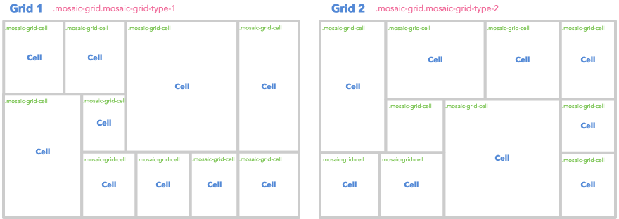
Previous Layout

The following is the default Grid Layout.
Back to Top

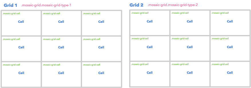
New Layout

To update the Grid Layout structure, we need to update the stylesheet. As you can see, all the cells should have 33.33% for both width and height.
Back to Top

Limitation

Previously there are 10 cells. However, in the new layout, you can only have 9. The only way to achieve this is by hiding the 10th tile with display: none;. That's probably not so good if you want to display all tiles.

Back to Top

Code

Let's implement the new layout!

Basic Style

You need to overwrite the stylesheet for both the cell dimension and the cell position. Place the following stylesheet into your Custom CSS editor to display the new layout.

/* Width & Height */
.mosaic-grid-type-1,
.mosaic-grid-type-2 {
    .mosaic-grid-cell-1,
    .mosaic-grid-cell-2,
    .mosaic-grid-cell-3,
    .mosaic-grid-cell-4,
    .mosaic-grid-cell-5,
    .mosaic-grid-cell-6,
    .mosaic-grid-cell-7,
    .mosaic-grid-cell-8,
    .mosaic-grid-cell-9 {
        width: 33.33%;
        height: 33.33%;
    }
    .mosaic-grid-cell-2,
    .mosaic-grid-cell-5,
    .mosaic-grid-cell-8 {
        width: 33.34%;
        height: 33.33%;
    }
    .mosaic-grid-cell-4,
    .mosaic-grid-cell-5,
    .mosaic-grid-cell-6 {
        height: 33.34%;
    }
    .mosaic-grid-cell-10 {
        display: none;
    }
}
/* Position */
.mosaic-grid-type-1,
.mosaic-grid-type-2 {
    .mosaic-grid-cell-1 {
        top: 0;
        left: 0;
        right: auto;
    }
    .mosaic-grid-cell-2 {
        top: 0;
        left: 33.33%;
        right: auto;
    }
    .mosaic-grid-cell-3 {
        top: 0;
        left: auto;
        right: 0;
    }
    .mosaic-grid-cell-4 {
        top: 33.33%;
        left: 0;
    }
    .mosaic-grid-cell-5 {
        top: 33.33%;
        left: 33.33%;
        right: auto;
    }
    .mosaic-grid-cell-6 {
        top: 33.33%;
        left: auto;
        right: 0;
    }
    .mosaic-grid-cell-7 {
        top: 66.64%;
        left: 0;
        right: auto;
    }
    .mosaic-grid-cell-8 {
        top: 66.67%;
        left: 33.33%;
        right: auto;
    }
    .mosaic-grid-cell-9 {
        top: 66.67%;
        right: 0;
        left: auto;
    }
}

Back to Top

Gap Style

To create gaps between tiles you can use the following CSS example.

@gap: 10px;
.tile {
    background: #000;
    // Gap Setting
    &-content {
        background: #333;
        box-sizing: content-box;
        margin: @gap 0 0 @gap;
        .mosaic-grid-cell-3 &,
        .mosaic-grid-cell-6 &,
        .mosaic-grid-cell-9 & {
            margin-right: @gap;
        }
        .mosaic-grid-cell-7 &,
        .mosaic-grid-cell-8 &,
        .mosaic-grid-cell-9 & {
            margin-bottom: @gap;
        }
    }
}

Back to Top

Demo

Click the following image to see the Event in your browser.

Back to Top