Customizing Carousel Event Screen
Overview
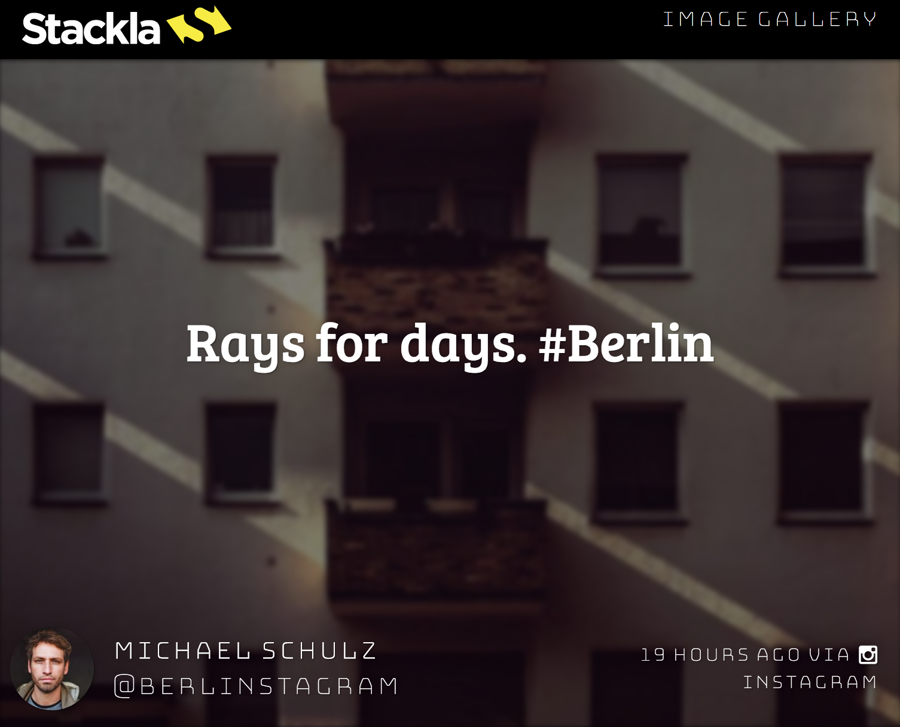
This section demonstrates how the Carousel Event Screen works. It will provide some assistance and clarity whilst troubleshooting specific tile display or missing issues.
How It Works
Queue
The queue is where our system holds tiles that will be displayed on the event screen. With the exception of pinned tiles, it's the amount of tiles that will be appended into the Carousel Event viewport.

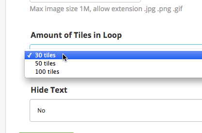
By default the queue has a capacity of 30 tiles. You can change the capacity by using Custom Javascript. A smaller queue causes a higher frequency of seeing the same tiles.
Whenever a new tile is received, the oldest tile will be removed from the queue.
If you use a high velocity term for your filter in the Event Screen, it's possible that all of the current tiles could be replaced with new ones after each queue check.
You can change the queue capacity by updating the Amount of Tiles in Loop option in Display Options.
Themes
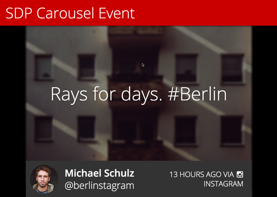
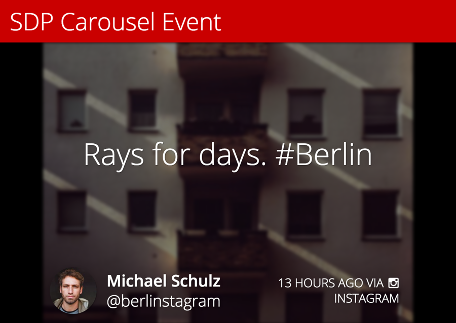
Currently we have two theme options. One is Less is More and the other one is Blocks.
Modes
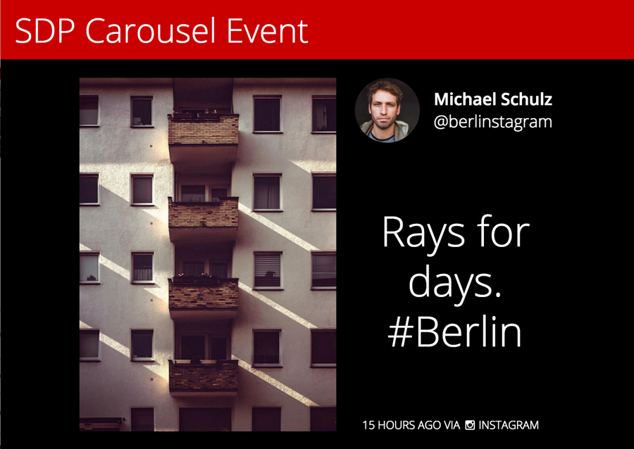
Currently we have the following different modes. There is also a Random option which applies different modes for different tiles randomly.
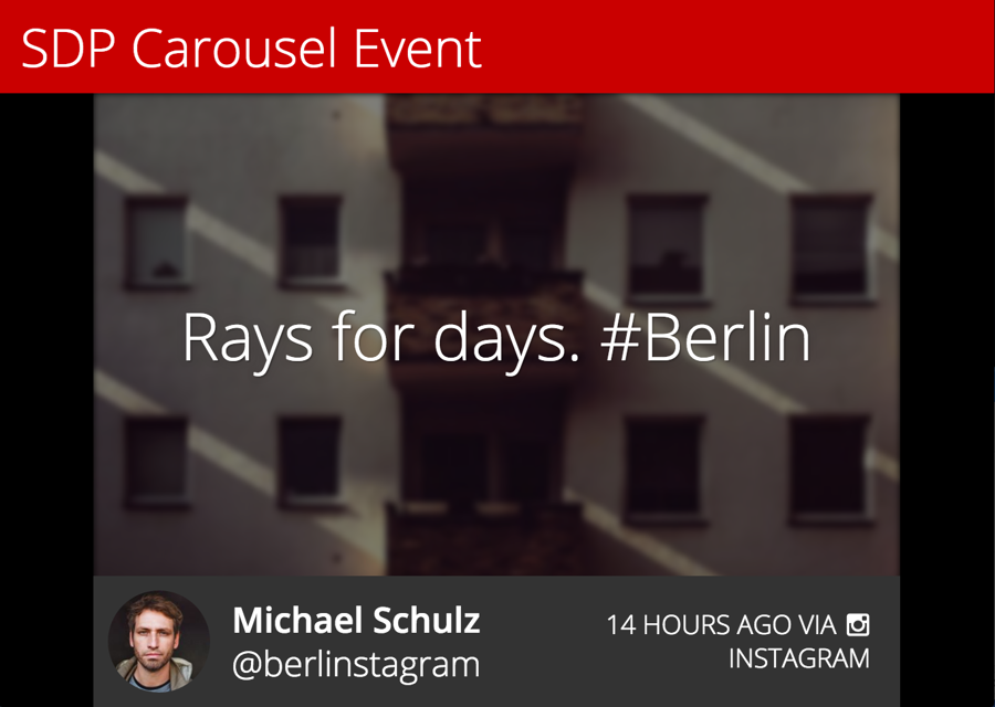
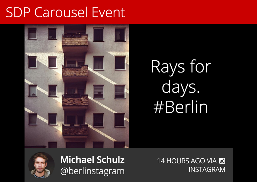
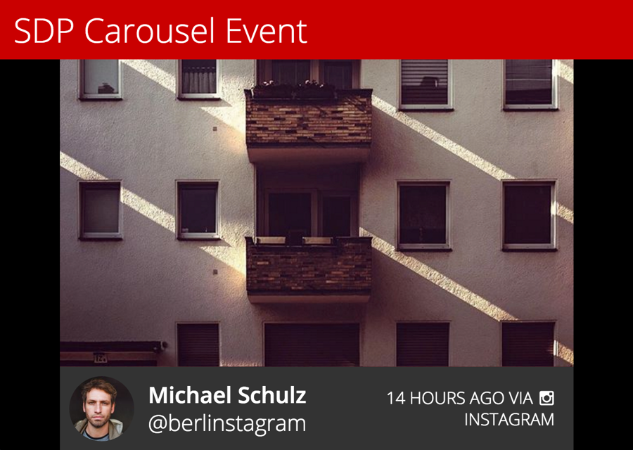
You can still configure the Themes option to have different visual presentation.

Queue and Slides
The tiles in queue will be converted to slides in the Carousel Event.
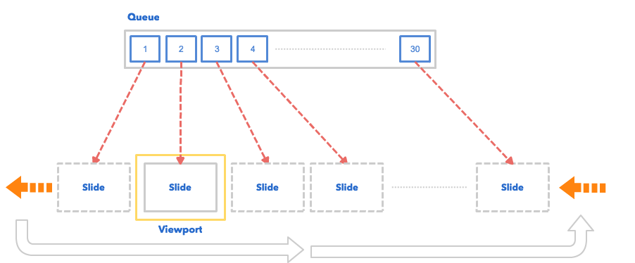
As illustrated, we have 30 items in the queue, and will get the exact same amount of slides in the carousel. Note that the pinned tile are not counted in the amount - this is something that you will need to consider. For example, if you set the Amount of Tiles in Loop to 30 tiles and you also have 2 pinned tiles. There will be 32 slides in the Carousel event.
Customizing CSS
Tile Structure
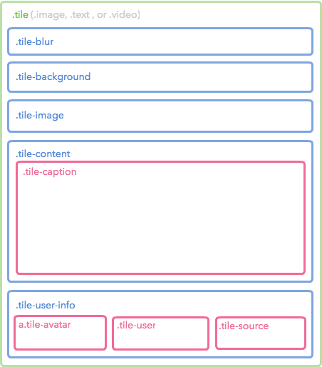
The Carousel Event Screen is mostly composed by tiles (slides), as such it's much easier to customize it when you are more familiar with its structure.
Diagram
Sample
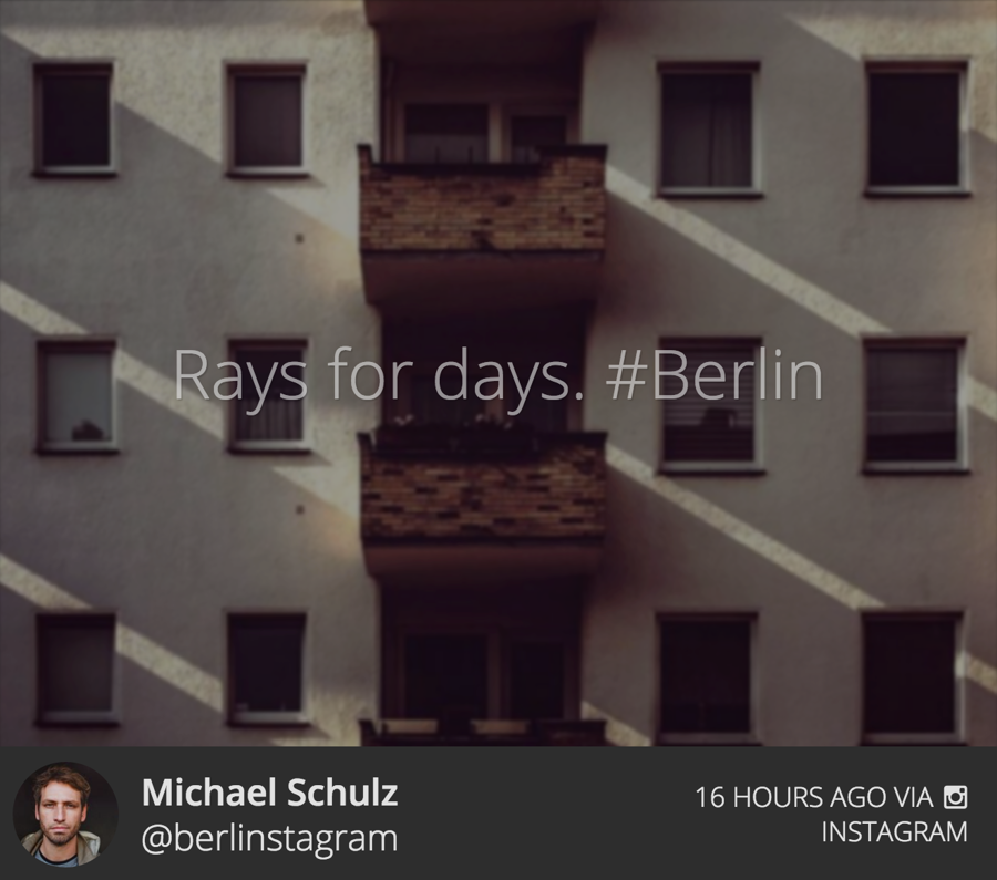
Code
The diagram above only shows until the 3rd level. Check the complete Tile structure by referencing the following code.
Customizing JavaScript
If you're looking to customize the Carousel Event Screen using our Javascript API - you can find the documentation here.
Available Libraries
The Carousel Event Screen currently has the following JavaScript libraries installed.
jQuery: You can access it by using
$global variable. The current version is 2.1.4.lodash: You can access it by using
_global variable. The current version is 3.10.1.Mustache.js: You can access it by using
Mustacheglobal variable. The current version is 0.8.1.dotdotdot: You can access it as a jQuery Plugin (
$.fn.dotdotdot). The current version is 1.6.7.slick: You can access it as a jQuery Plugin (
$.fn.slick).
Sample
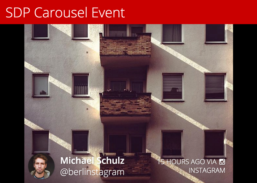
The following is an example of the customized Carousel Event Screen. Click the following image to see the Event in your browser.
Custom Header
The default header which Nosto's UGC provides is very basic and only shows the name and the hashtag. In this example we've demonstrated a different HTML structure for the header. You can use the following code to achieve this:
Custom CSS
The above code will be wrapped by a
with the ID of custom-header. You have to apply the style to make it pretty.
